The links below will provide access to my Google Sketchup Models and the Lumion environments (draft and final).
Google Sketchup Models
https://www.dropbox.com/sh/og9bnapum9t5bp0/AACpr5CQ4AdDvPRVMvjn0yova
Lumion 4 Files
https://www.dropbox.com/sh/mptwst8y06zqbg5/AACL88by1WN0-f4KDyLPITgRa
Thursday, 26 June 2014
Custom Textures Utilised in the Models
Custom textures were designed as requested in the brief with regards to movement in space.


A handful have been selected for use in the Sketchup Model due to their relationship with the specific components of bridge. For example, curvilinear elements are textured with a pattern that resembles 'rotation'.
This texture is applied to the organically-formed main walls as the arching features possess a rotational value. Both the interior and exterior curvilinear walls have been coated with this pattern as well as a majority of the flooring.


ROTATIONAL
This texture is applied to the organically-formed main walls as the arching features possess a rotational value. Both the interior and exterior curvilinear walls have been coated with this pattern as well as a majority of the flooring.
The screenshots below show the features which are highlighted by the rotational texture, including the curvilinear exterior and interior walls and floor.
LINEAR
This set of patterns are utilised on the more rectilinear, block-like side of the structure as they represent the notion of linear movement. Each of these textures resemble different aspects of linear patterns.
This texture symbolises linearity in a cluttered, disorganized form and in turn, this evokes the idea of noise and disruption, which would be present in public spaces. Hence, this pattern is placed predominantly within the public areas of the rectilinear division, mainly on the top floor and the public meeting room for students (located at the bottom floor).
Also, the texture is highlighted with a bright pink tinge to hint to a more lively atmosphere.
This second texture is applied to the architectural folly. This one is more uniform and clean-cut in comparison to the above texture. However, there are still minor defects in linearity such as the discontinuous lines.
This next texture is utilised to a great extent on the exterior of the rectilinear component of the university. Although the shapes are clustered, they retain a degree of order as the lines are all perpendicular with each other.
SWAY
The idea of the 'sway' movement is to maintain equilibrium between linear and rotational, where it lies in the middle (neither very curvilinear not rectilinear).
Due to this notion, the first 'sway' pattern utilised (below) integrates seamlessly with the university, where it is utilised in the rectilinear-dominant half of the model. In the screen-captures underneath, the interiors of the study rooms are coated with this texture in a blue tinge. Blue was selected as it acts as a soothing, calm, quiet symbol, which is what is desired in study areas and offices.
Finally, this sway pattern is used in the barriers of the studios and other key interior walls. It is a green colour in the university in order to create a clear distinction for the viewer to see that he/she is about to enter a key component of the building. For example, this is shown in the last image of the computer lab entrance wall.
Screen-Captures of the Final, Developed Submission for Experiment 3
The images below illustrate the interaction between the university, the pair of moving elements, the architectural folly and the landscape.
This screenshot is a high viewpoint shot of the back elevation of the bridge, also exhibiting the folly and a moving element interacting each other (where the platform is ready to pick up/drop off passengers).

This image is a view from the valley floor, facing the side elevation of the architectural folly. It highlights the environment much more than the other screencaptures due to the camera positioning. The front elevation of the bridge is visible as well as the bottom.

The camera is placed level with the front elevation of the university bridge, allowing the viewer to observe every key component of the submission at a reasonable distance.

Below is an image of the submission from afar, placing more emphasis on the landscape and how the bridge was placed inside it. The Gunung Semeru possesses a rare patch of vegetation which I took advantage of and hence situated my models in that valley. There are countless more options for the placement of the models, however, I felt that the slight patch of green had to be reinforced.

This final picture is a screenshot from afar, like the one above, except it captures the back elevation of the bridge and the moving elements much clearer.

Virtual Tour of the Interior of the University Bridge
Embedded below is a video highlighting the key features and spaces in the interior of the university.
Short Videos of the Movement of the Moving Elements
The main focus for these moving elements is to provide a contrasting view of the architecture (in particular, the folly and the university) when travelling on these moving elements. The movement is captured in brief clips embedded below.
FOR BEST RESULTS, PLEASE WATCH THE VIDEO ON YOUTUBE, NOT THE BLOG.
FOR BEST RESULTS, PLEASE WATCH THE VIDEO ON YOUTUBE, NOT THE BLOG.
MOVING ELEMENT 1
This element travels from outside the university grounds to the university, so that people avoid having to travel extensively on the unstable, rocky, sandy terrain. Since there is a slight incline in the position of the moving element with respect to the bridge, the commuters gain a more wholesome view of the university's exterior.
Furthermore, after it halts at the university entrance momentarily (for the drop off and pick up of passengers), it travels from the university entrance to the architectural folly, located much lower, at the valley floor. During the trip, viewers will be able to observe and appreciate the mountainous environment.
MOVING ELEMENT 2
This element is essentially a platform that specifically operates between the alternate entrance of the university to the folly. This element is primarily for staff and the Dean. Only a select few students are permitted to enter the architectural folly during the Dean's monthly lunch.
Developed Lumion Landscapes
From the 'Preliminary Lumion Landscapes' post, I have developed the two landscapes further into near-finished products. Though the criteria only asks for one developed Lumion model, I feel that having two fairly developed landscapes at my disposal is an advantage.


GUNUNG RINJANI
The screenshot below is of the draft landscape. This is placed here to provide a contrast between the draft and developed landscape
The two images below are of the more developed terrains. The biggest improvements made were the additions of vegetation to the mountainous terrain and also the water mist hovering over the water. Minor height modifications were conducted to fit the Google Sketchup model appropriately.
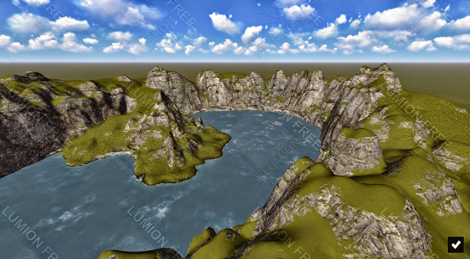
GUNUNG SEMERU (UTILISED FOR THE FINAL SUBMISSION)
The below Lumion landscape is the draft that was created earlier.
From observing the screenshots underneath, there is more variations in terms of ground terrain, where it contains patches of grass on the ground and rock faces. Also, slight vegetation is added and heights are more emphasised by creating larger disparities between grounds and mountaintops.
Moving Elements
Two moving elements are required for Experiment 3 that are strategically placed and moved in a way that emphasises the features of the university bridge and the folly.
This element is utilised as a lift, or transitional intermediary for people to enter or leave the university.
The first moving element is inspired from the set of two-point perspective sketches shown below.

The google sketchup model of the sketches is below.


MOVING ELEMENT 1
This element is utilised as a lift, or transitional intermediary for people to enter or leave the university.
The first moving element is inspired from the set of two-point perspective sketches shown below.
The google sketchup model of the sketches is below.
MOVING ELEMENT 2
This moving element is essentially a piece of the folly cut out and able to be re-assembled perfectly back into the folly like a puzzle piece. It is used as a platform to transport students/staff to and from the university and the folly.
The first image highlights the exact space cut out from the architectural folly which was used as the foundation of this second moving element.
The second image conveys the moving element removed from the folly, with barriers (for safety precautions) and stairs (used as an intermediary from the landscape to the moving platform) added.
Wednesday, 25 June 2014
Progress for Experiment 3, 25 June 2014 (Interior Detailing)
For time efficiency reasons, the interior detailing (such as furniture) was prioritised last, as they may be too time consuming and prone to technical malfunctions. Each key space contained specific features suiting its operation (e.g. a studio will possess tables and chairs for students to work).
The plethora of screenshots below provide an image of each significant interior space, with detailing where appropriate:


.jpg)


The plethora of screenshots below provide an image of each significant interior space, with detailing where appropriate:
LECTURE THEATRE
STUDIO SPACE 1
GALLERY
At the commencement of a fresh semester, students have not completed any major work yet, leaving this gallery empty for now.
COMPUTER LABS AND STUDYING SPACE
WORKSHOP
Since this is set at the start of a semester, all classes are going through a briefing phase, where practical activities are not conducted yet.
STUDIO SPACES 2 AND 3
PUBLIC MEETING SPACE FOR STAFF
OFFICES AND MEETING SPACES FOR GENERAL STAFF
ENTRANCE TO PUBLIC MEETING SPACE FOR STUDENTS
PUBLIC MEETING SPACE FOR STUDENTS (stairs lead to mezzanine level)
OFFICES AND MEETING ROOMS FOR ACADEMIC STAFF
The first image conveys the meeting room with large desks and the second picture depicts office desks with a central table for meetings/breaks etc.
MEZZANINE LEVEL
TOP LEVEL/LIBRARY FLOOR (STUDY AREA)
STUDY ROOMS ON THE LIBRARY FLOOR
MORE PUBLIC SPACES ON THE LIBRARY FLOOR
Subscribe to:
Comments (Atom)